Google Testing Out New YouTube on Chrome?

To back up the story a bit on why I was using Chrome, Derek has convinced me to abandon Adobe Flash a long while back and so far it’s worked out pretty well. I use Firefox as my main browser, but in the small chance that I need to use Flash (e.g. a particular YouTube video that doesn’t have HTML5/webm support yet), I switch over to Chrome, which comes with Flash support built-in.

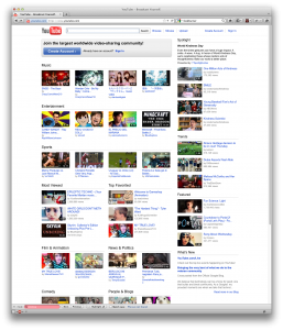
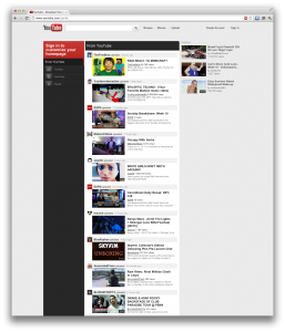
So last night I noticed a big change in YouTube’s UI:

YouTube on Chrome

But was shocked to find out they reverted back today:

YouTube on Firefox

Turns out if you’re using Chrome, you get their new shiny unified (Google Plus) interface, but if you’re using any other browser (so far I’ve tested Firefox and Safari), you get their old look.

Google – Big Brother

So yesterday my sister sends me a link to Williams Sonoma. Guess what happened over the course of the next 24 hours.

Williams Sonoma Google Ads Williams Sonoma Google Ads

Yep, William Sonoma Google ads plastered everywhere I go.

Google Is Too All-Knowing

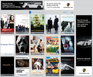
HD-Trailers.net Vancouver Ad

It’s rather scary to see how much Google knows about you. I’ve been planning to trip to Vancouver / Victoria Island / Whistler these past couple of days (brother is coming up to visit) and the funny thing is I’ve been using Bing for my web searches (for hotels and what to do). The only thing I used Google for was Google Maps to see how long it’ll take to drive from Vancouver to Whistler, where the ferry ports were located, and just a general sense of where stuff are. Don’t ask me why, but for some reasons I prefer Google Maps over Bing Maps.

Within hours of doing that search, I see the above ad on my website. And it just scares me about how much Google knows.

Bloglines Alternatives

I’ve been using Bloglines for the past year or so as my rss aggregator, but recently it’s been a lot flakier than usual. So when it stopped updating feeds this past Wednesday and their forums were down again, I decided to scope out some different readers. I found the following list somewhere:

I heard some good things about NewsGator in the Bloglines forums some time back when Bloglines first started having problems. They mentioned it was quite easy to switch and that I can just export my feeds from Bloglines as an OPML file and import them into NewsGator. I gave that a shot and it worked fine. So the past few days, I’ve been playing with NewsGator and there are quite a few things I miss from Bloglines.

My biggest pet peeve of NewsGator is that it’s extremely slow and unresponsive. It takes like 5-10 seconds to load a folder, while it was extremely fast and snappy in Bloglines. Another feature that Bloglines has are keyboard shortcuts. After a few days of using NewsGator, I have to say I’m not a satisfied customer.

The one thing good about NewsGator is that it updates the feeds a lot more frequently than Bloglines. Things may take up to half a day to show up on Bloglines, but new posts generally show up within the hour on Newsgator.

They also have a client version, but I would rather not have to install an RSS aggregator client on all the machines I use.

I know a few friends who use Google Reader. Maybe I’ll give that a try. What do you guys suggest?

Google’s New FavIcon

Not sure how many of you have noticed Google’s new favorite icon (aka favicon or shortcut icon):

Google's FavIcon

It’s basically the little icon that shows up next to your address bar or the icon that gets saved when you try to bookmark a page. Anyway, when I first saw it a couple days ago, I was confused which site actually uses that icon and when I realized it was Google, I was even more confused. It used to be a capital ‘G’ on white background with and blue border. Now, it’s the little ‘g’ in the 4th letter of Google. What confused me was that it was in on a gray background, and due to the style of the ‘g’, it reminded me of some soap or shampoo logo.

Update: It turns out it’s only gray because it’s using transparency. On a gray background, it’s gray. On a white background, it’s white. The tabs on Firefox by default are gray, hence:

Google's FavIcon

Update #2: Thanks to RayAlome for pointing me to the official Google blog entry of their new favicon: One Fish, Two Fish, Red Fish, Blue Fish