Update: This post was drafted back in October 2009. I had submitted it as feedback to Microsoft/Xbox 360, but never really heard back. Steam just announced their Big Picture which featured a keyboard system (Daisywheel) very similar to mine (I know there are quite a few differences), so I decided to publish this post.
During the past Xbox 360 beta, I had made the following suggestion to the Xbox 360 team.
I’ve always found the keyboard UI to be clunky and difficult to use with the controller. I understand the chatpad or a keyboard would make it more easy, but I’m pretty sure most people using the Xbox 360 still use the controller to type in text. When I found out I could redeem codes via their website, it was a blessing. Typing those 25 character codes always took an inane amount of time. Now that they plan on releasing Twitter and Facebook and other apps that can require a lot typing, it’s ridiculous to use the existing keyboard UI with the controllers to type.
That’s what got me thinking of a better keyboard UI with the current controllers.
Currently we use the L-joystick for moving the cursor up/down/left/right and hitting A to select a character. To enter 1 character, I may have have to move the cursor up to 15 steps.
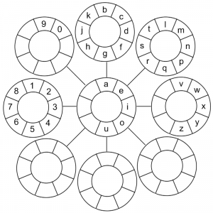
One thing I’ve been thinking of is that we have 2 joysticks, each with 4 axis with 8 degrees of control, which we do not take advantage of. 8 x 8 is a total of 64 possible characters. If you consider the center position (joystick in relaxed position) to be another state, that’s 9 x 9 = 81 possible characters.
Here’s a rough sketch of what the UI would look like:
To type the number ‘1’, all I would have to do is point the L-joystick left, point the R-joystick up, and then push on R-joystick. Each letter would only take 3 actions (move L-joystick, move R-joystick, push on R-joystick).
That leaves the buttons (A, B, X, Y), bumpers and triggers to do other stuff like delete or move the cursor. You can even dedicate a button to switch back to the current keyboard mode. The D-pad would be perfect for this job.
As you may have noticed in my sketch, there’s a lot of empty spaces. I originally thought of putting every single character (symbols, numbers, both upper and lower case characters) on that, which is still a viable idea. Another option would be to drop that down to 5 circles (center, up, down, left, right), each circle having 8 possible characters like it is now, giving me 40 characters, which is about the same amount of characters on-screen today. You would then use the D-pad to toggle between upper and lower case, as well as symbols.
Of course there’s still more stuff to flush out, but I thought the idea was sound.
Also, given that the PlayStation 3 has a similar controller, I could see this being used on their console UI also.


